Nursing Course Shell Redesign

The following are examples of course shell page that I have redesigned for the Nursing program at Riverside Community College District:

1. Homepage

I redesigned the course homepage from a traditional Canvas Modules page that displayed all course materials into a visual, user-friendly interface using a combination of CidiLabs DesignPLUS features, HTML, and CSS.


Descriptive Text: Course homepage for “NRN-21: Medical-Surgical Nursing Across the Lifespan.” At the top, a blue banner labeled “NRN-21 Course Homepage” features a large photo of two healthcare workers in blue scrubs and face masks standing beside a hospital bed in a clinical setting. Below the banner is a welcome message introducing the course. The page is organized into three sections with blue circular icons and centered headings: “About the Course,” “Learning Tools,” and “Resources.” Each section contains rectangular navigation tiles with light blue or beige title boxes and line-art icons. About the Course includes links for Syllabus, Your Instructors, Session Materials, About Clinicals, and Schedule Central. Learning Tools includes Learning Tools, Exam Resources, and Dosage Information. Resources includes SON Info, ADN Handbook & Policies, Student Outcome Specialist, and Community Engagement & Volunteer Opportunities. The page uses a clean white background, blue accents, thin horizontal divider lines, and orange borders around the banner image and near the bottom of the page. An expandable “Image Credits” section appears at the bottom.
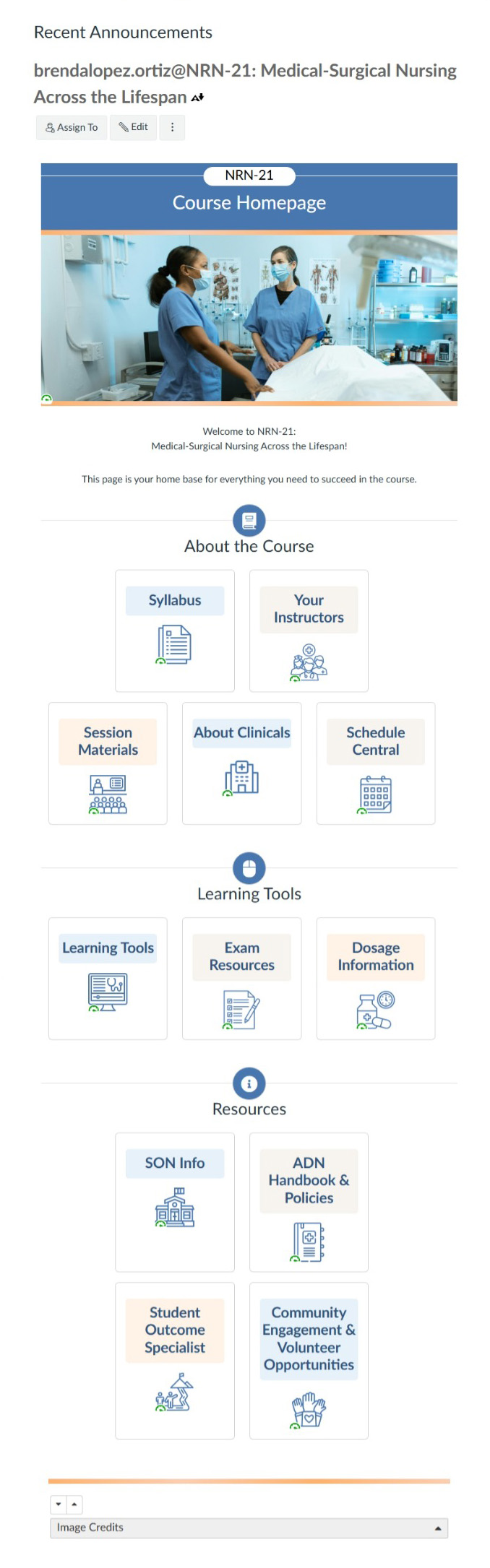

Nursing course homepage showing icon-based navigation

2. Syllabus

The syllabus was originally provided as a Word document without accessible features such as headings and subheadings. I reorganized the content into major sections and used accordions, tabs, and other CidiLabs DesignPLUS features to create a clear, structured, and accessible layout.


Descriptive Text: 

Course syllabus page for “RCC Medical-Surgical Nursing Across the Lifespan.” The page uses a vertical, single-column layout with a white background, blue accents, and orange divider lines. A blue course banner at the top contains the RCC logo and a healthcare-themed image. Below the banner, the content is divided into multiple sections identified by blue circular icons and centered section headings.

The page begins with “Course Syllabus and Calendar” and “About the Course,” followed by introductory text describing the course and student learning outcomes. Additional sections include “Nature of Instruction,” “Location of Practice,” and “View of Curriculum Design,” each containing several paragraphs of text.

A “Required Text(s)” section lists course materials with book and resource icons. “Your Instructors” displays a table with instructor names, contact information, office hours, and other course-related details. “Evaluation of Learning” contains grading policies and a grading scale table showing grade ranges and percentages.

The page continues with extensive text-based sections on missed assignments, requests for extensions, standardized exams, technology requirements, and course policies. Additional sections address creating tickets for support, expected work attendance, safety requirements, evacuation procedures, expectations for civility, adding and dropping courses, maintaining communication, academic integrity, artificial intelligence use, and accommodations for disabilities.

Near the bottom, a “Student Support” section provides information about academic and personal resources available to students. A “Majoring RCC Nursing Course Requirements” section presents a collapsible checklist-style table with rows of requirements. The final section, “Course Calendar,” displays a long accordion-style list of weeks labeled Week 1 through Week 15 and additional course schedule entries. The page ends with a thin orange horizontal line spanning the width of the content area.

Nursing course syllabus

3. Instructors

Instructor information was previously presented through a combination of Word documents and links within Canvas Modules. I consolidated all instructor information into a single page, with relevant contact details displayed consistently across all instructor profiles.


Descriptive Text: 

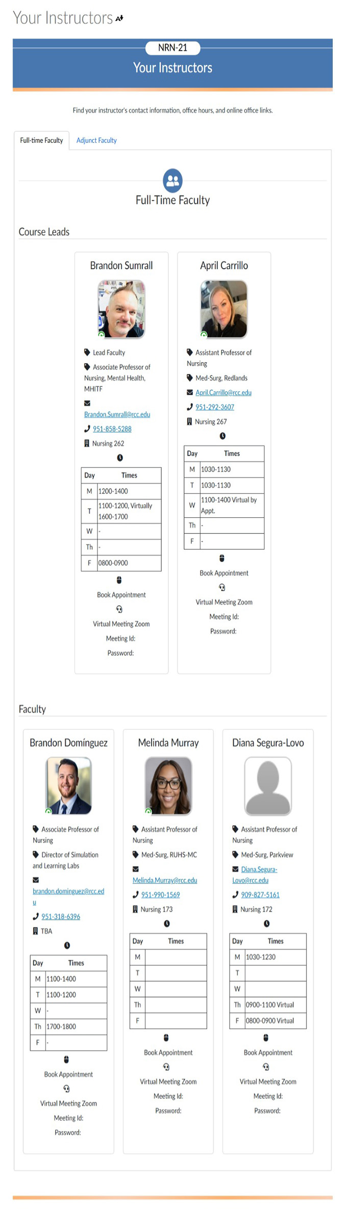
Instructor directory page for the “NRN-21 Your Instructors” section of a nursing course website. The page features a white background with blue and orange accent colors. At the top is a blue banner labeled “NRN-21 Your Instructors,” followed by a brief statement indicating that instructor contact information, office hours, and online office links can be found on the page.

Below the banner are two tabs labeled “Full-time Faculty” and “Adjunct Faculty,” with the Full-time Faculty tab selected. A blue circular icon with a group of people appears above the “Full-Time Faculty” heading.

Faculty information is displayed in a grid of bordered profile cards. Each card contains a headshot or profile image near the top, followed by contact details presented with small icons. Information includes faculty title, teaching area or campus affiliation, email address, phone number, office location, and office hours. Office hours are arranged in a compact table with days of the week listed in one column and available times in the other. Beneath each schedule are icons and links for booking appointments and joining virtual meetings.

The page is divided into two subsections: “Course Leads” and “Faculty.” The Course Leads section contains two larger profile cards displayed side by side. The Faculty section below contains three profile cards arranged horizontally. Most cards display professional portrait photographs with rounded corners, while one card uses a gray placeholder silhouette image instead of a photograph.

The overall layout is structured and symmetrical, using light gray borders, blue hyperlinks, black text, and consistent spacing between cards. A thin orange horizontal line runs across the bottom of the page, visually marking the end of the content.

Nursing course instructors

4. Course Session Links

The links to course sessions were previously presented on the Modules page with little organization to facilitate access to relevant materials. I created a dedicated page featuring icons that represent each session topic, organized alphabetically and linked to the corresponding session content page.


Descriptive Text: 

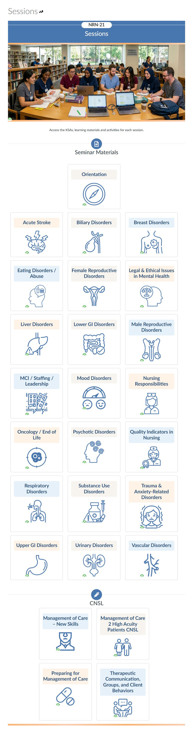
Course “Sessions” page for NRN-21 with a clean white background, blue accents, and orange divider lines. At the top, a blue banner labeled “NRN-21 Sessions” appears above a large photograph showing a group of nursing students gathered around tables in a library or learning commons. Several students are reading, writing, and using laptops while seated together in a collaborative study environment. Large windows and bookshelves are visible in the background.

Below the banner, a short description explains that the page provides access to KSAs, learning materials, and activities for each session. The main content is organized into sections marked by blue circular icons and centered headings.

The first section, “Seminar Materials,” presents a grid of large navigation tiles. Each tile contains a topic title in a pale blue or light beige header box and a matching blue line-art illustration beneath it. Topics include Orientation, Acute Stroke, Biliary Disorders, Breast Disorders, Eating Disorders/Abuse, Female Reproductive Disorders, Legal & Ethical Issues in Mental Health, Liver Disorders, Lower GI Disorders, Male Reproductive Disorders, MCI/Staffing/Leadership, Mood Disorders, Nursing Responsibilities, Oncology/End of Life, Psychotic Disorders, Quality Indicators in Nursing, Respiratory Disorders, Substance Use Disorders, Trauma & Anxiety-Related Disorders, Upper GI Disorders, Urinary Disorders, and Vascular Disorders. The illustrations depict related concepts such as anatomical organs, medical equipment, healthcare professionals, mental health symbols, and disease-specific imagery.

A second section labeled “CNSL” appears farther down the page. This section contains four large rectangular tiles arranged in a two-by-two grid. Each tile includes a title and a blue line-art icon representing nursing practice, patient care, medication management, or communication skills. The tiles cover Management of Care, High Acuity Patients, Preparing for Management of Care, and Therapeutic Communication and Client Behaviors.

The overall layout uses evenly spaced cards with light gray borders, blue iconography, centered text, and a consistent visual style throughout. The page ends with a thin orange horizontal line spanning the width of the content area.

Nursing course session links

5. Course Session Page

Course session content was presented in Word documents, through links within a course session module, on a course session page, or through a combination of these formats. I integrated all content into Canvas pages and organized it into consistent sections across all session pages.


Descriptive Text: 

Course session page for the topic “Acute Stroke” within the NRN-21 nursing course. The page uses a white background with blue accents, gray content panels, and orange divider lines. At the top is a blue header banner labeled “Management of Patients with Cerebrovascular Disorders KSA.” Below the banner is an instructor section featuring a blue line-art nursing instructor icon, instructor name, credentials, and an email link.

The page is organized into multiple vertically stacked sections marked by blue circular icons and centered headings. An introductory section provides a brief description of the learning activities and preparation required for the session.

The “Learning Outcomes & Objectives” section contains expandable accordion panels. One panel displays learning outcomes as linked objective codes arranged in a horizontal row. Additional panels present bulleted competency statements and numbered learning objectives.

The “Knowledge” section contains collapsible content areas for reading assignments, journal articles, videos, worksheets, and study resources. Reading materials are presented as linked text references. A large embedded video thumbnail shows a presenter standing indoors with a red play button centered over the image. Below the video is a worksheet section containing a document viewer with a scrollable PDF preview showing a detailed clinical assessment form displayed inside a gray frame.

The study section includes a colorful educational infographic labeled “B.E. F.A.S.T.” illustrating stroke warning signs. Large red letters spell “B E F A S T” across the image, accompanied by cartoon-style illustrations and explanatory text. A text-version transcript of the infographic appears directly underneath in a bordered content box.

A “Passport for Entry” section features completion requirements displayed as linked checklist items. The “Do Prepare!” area is arranged as a six-card grid. Each card has a title, icon, and brief preparation expectations related to readings, case studies, review policies, device readiness, internet access, and uniform requirements.

Near the bottom, separate sections labeled “Skills” and “Attitudes” are identified by blue circular icons and brief text descriptions outlining session expectations. The page maintains a consistent visual style with collapsible panels, bordered content boxes, blue hyperlinks, nursing-themed icons, and structured learning resources presented in a single-column layout optimized for scrolling. An orange horizontal line marks the bottom of the page.

Nursing course session page

6. Informational Pages

Informational content was presented as links on the Modules page or within Canvas pages. I presented this content as embedded files instead. Rather than editing the page itself, the instructor only needs to upload a newer version of the file, which is then automatically displayed on the appropriate page.


Descriptive Text: 

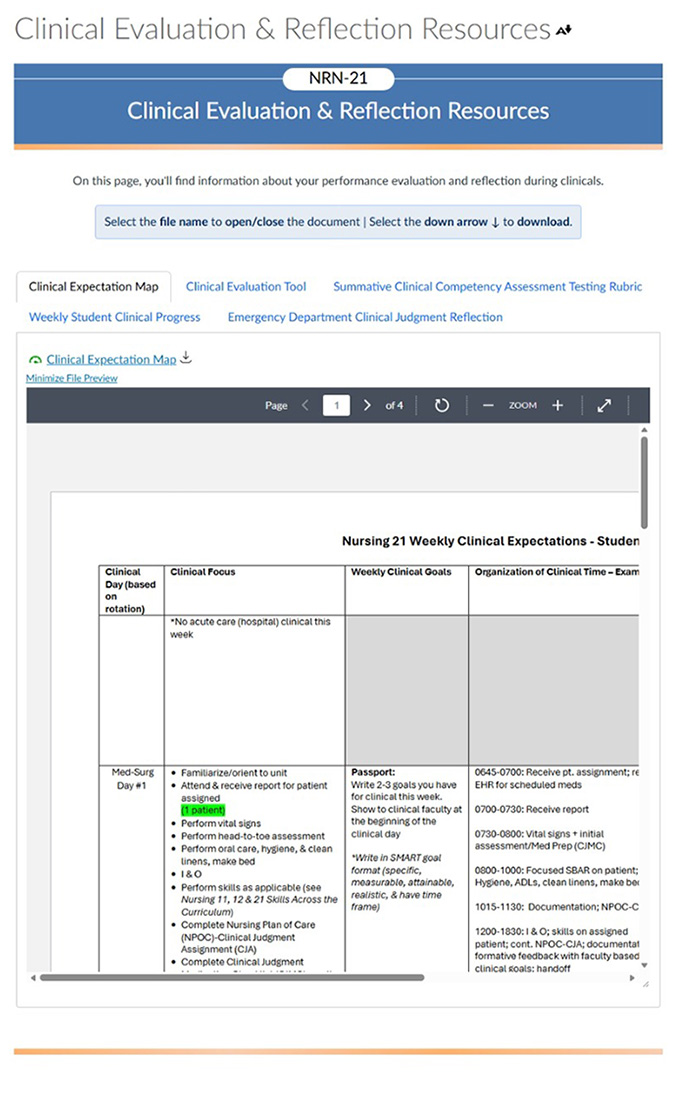
Clinical Evaluation & Reflection Resources page for the NRN-21 nursing course. The page features a white background with blue accents, gray content panels, and orange horizontal divider lines. A large blue banner at the top is labeled “Clinical Evaluation & Reflection Resources” and includes an NRN-21 course identifier in a rounded white tab.

Below the banner is a brief introductory paragraph explaining that the page contains information about performance evaluations and clinical reflections. A light blue instruction box provides guidance for opening and downloading documents. Beneath the instructions is a row of navigation tabs linking to resources such as the Clinical Expectation Map, Clinical Evaluation Tool, competency assessment rubrics, weekly clinical progress materials, and reflection documents.

The center of the page is dominated by a large embedded document viewer framed within a light gray content area. The viewer includes a dark toolbar across the top with page navigation controls, zoom buttons, rotation tools, and download options. A vertical scrollbar appears along the right edge of the document frame.

Inside the document viewer, the first page of a clinical expectations worksheet is displayed. The worksheet contains a large multi-column table with bold column headers and numerous rows of structured content. Visible columns include categories related to clinical day, clinical focus, weekly goals, and organization of clinical time. The table includes bullet points, highlighted text, and scheduled activities arranged in a grid format. Horizontal and vertical scrollbars are visible within the document preview, indicating additional content beyond the displayed portion.

The overall page layout is designed to emphasize document access and review, with tabbed navigation above and a large embedded PDF-style preview area occupying most of the screen. A thin orange line runs across the bottom of the page, visually marking the end of the content area.

Nursing course information page

AI Use in the Redesign

This project entailed redesigning four undergraduate courses that contained a wide range of materials and were organized differently from a typical university course. I primarily used Copilot, Adobe Firefly, and the AI assistant provided by the textbook publisher. I used AI to:

  • analyze and categorize course files to understand the types of materials provided by the professors,
  • extract unique file names from folders containing multiple versions of the same files,
  • create design schemes (e.g., gradient color palettes based on the institution’s brand colors),
  • create images to use as illustrations in Storyline,
  • synthesize several schedules into a comprehensive master course schedule,
  • produce first drafts of assessment feedback,
  • create HTML pages using content from Word documents and code from a template,
  • proofread email messages, and
  • extract text from lecture files.